Creadefy's new logo: the meaning behind the design
Explore Creadefy's new logo design: how the block, the C, and the check create a distinctive identity for a platform built around verifiable certificates.
By Nikhil Shukla ·
A certificate can travel much further than the event that produced it. Someone adds it to a portfolio, shares it on LinkedIn, or sends it with a job application months later. The organiser has moved on to the next program. The certificate still has work to do.
That is the context in which I think about Creadefy's identity. The product sits between the person issuing a credential and the person trying to understand what it means. Its logo needs to feel at home in both places.
Creadefy's new mark brings an angular C and a check into a compact, block-like shape. The breakdown makes that construction easy to see.
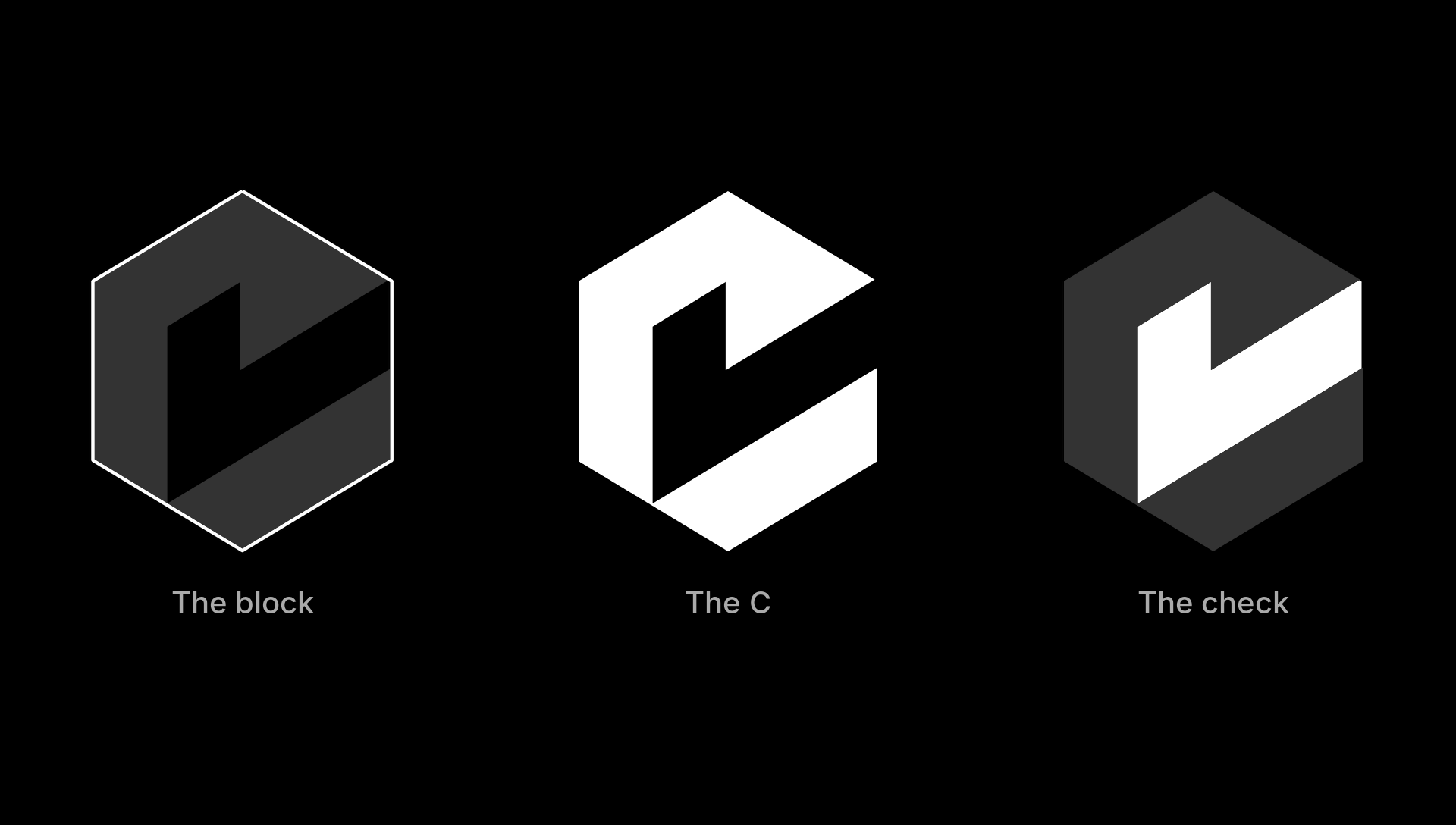
There is a satisfying economy to it: the same edges do more than one job. You can recognise the letter before noticing the check, then return to the overall shape and see how they fit together. I like that the mark rewards a closer look while remaining simple enough to use without an explanation beside it.
A clearer identity for the product
I have written before about how Creadefy started. Working around developer communities and events exposed a familiar problem: the template lived in one tool, the recipient list in another, and delivery became a separate round of manual work. Verification was another question entirely.
Creadefy brings those tasks into a connected certificate workflow. An organiser can work with a reusable template, issue personalised credentials in bulk, and give recipients a public record they can share.
That combination gives the identity a useful direction. The software has to be practical for the organiser and credible when someone opens a credential later. I want the visual language to carry the same sense of clarity.
The new mark gives that direction a concrete form. Its shared angles connect the initial and the verification symbol without fitting one inside a separate badge.
The block gives the mark its structure
The outer shape has the appearance of an isometric block. Its angled sides create a sense of depth without needing a gradient, a shadow, or a rendered surface. The geometry does the work.
For me, the useful connection is to structure. Certificate issuance involves information that needs to stay organised: a design, a recipient, an achievement, and the record of who issued it. Reusable templates and consistent fields give that information a dependable form.
The block is a visual way to think about that foundation. Its edges establish the space in which the C and the check can exist. Even with part of the shape opened up, the overall form remains easy to follow.
The result has a definite silhouette and a feeling of solidity that suits a product people use to handle important records. There is also a pleasing balance between the enclosed outer form and the open space through its centre. The shape feels substantial without becoming heavy.
The C keeps the name close
The C is the most direct part of the identity. It gives the symbol a connection to Creadefy that survives when the full wordmark has to disappear.
This C has straight edges and an open right side. It follows the angles of the surrounding block, so it feels like part of the same construction. The letter is visible through the arrangement of the shape rather than added as a separate character inside it.
That distinction matters in everyday use. A dashboard sidebar or a browser tab has very little space. A complete wordmark asks too much of it. A compact letterform gives the product something recognisable to use there, while the full name can appear where the layout allows it.
The diagonal opening gives this C its particular character. It also makes room for the check to follow the same angle, so the two readings use the same space.
The check connects the identity to verification
The check is the part I keep coming back to because it connects so directly to the purpose of a credential.
A certificate says that someone participated, completed a program, or earned an achievement. The person reading it should have a way to check that statement against the issuer's record. Visual polish alone cannot answer that question.
In the breakdown, the check follows the same angular construction as the rest of the mark. It fits into the block and shares the diagonal movement of the C. It feels integrated into the shape, which is appropriate for a product where verification belongs inside the issuance workflow.
On Creadefy, a credential's public verification page provides a place to check its details and status. A recipient can share that link, and someone else can open it without creating an account. The verification page is an entry point into that experience.
The check is a useful association, but it also sets an expectation. People need to understand what they are checking and who issued the credential. The interface and the underlying record have to support that understanding every time.
Why the monochrome construction matters
One of my favourite qualities of this mark is how much it communicates through shape. In the breakdown, the black background and white forms make the construction clear. Grey helps separate the block from the other elements without adding a second visual language.
That gives the identity room to work alongside other brands. Certificates usually belong visually to the organisation issuing them. Its colours, logo, and typography should have a clear place. Creadefy's identity needs to fit into that environment with restraint.
A monochrome mark is useful on a quiet dashboard as well as beside a colourful certificate design. It also gives us a clear starting point when considering smaller uses. The practical questions become easy to ask: is the opening in the C still clear? Can you distinguish the check? Does the silhouette remain recognisable?
Those questions matter more to me than how dramatic the logo looks on a large presentation slide. The small version will do a lot of the daily work.
The identity has to work beyond the dashboard
An organiser sees Creadefy while setting up a template or preparing a recipient list. Their concerns are immediate: get the details right and finish the batch. The interface should make that work feel orderly.
A recipient arrives with a different purpose. They want their certificate, a way to share it, and confidence that the information is correct. Someone verifying it later may have no previous relationship with Creadefy at all.
That last person is a useful test for the whole experience. The credential page needs to explain itself. The logo can establish a consistent identity, but the page still has to make the issuer and the credential details easy to understand.
In each of those moments, the achievement should have the reader's attention. I want the identity to provide a familiar point of reference while the page explains the credential.
A mark I want the product to earn
The block, the C, and the check give Creadefy a clear visual identity. I like the geometry, and I like how closely the check relates to the work the product does.
The more demanding part is making the experience deserve that association. Templates need to be usable. Bulk issuance needs to save organisers time. A verification page needs to give someone a clear answer about the record they have opened.
That is where my attention stays as I build. I have written a separate article about Creadefy's certificate generation workflow, including AI templates and bulk issuance, for a closer look at the product behind the identity.
You can explore the new look at creadefy.com. The next time you see the mark, take a second look at the space inside it. That is where the C and the check meet.